Or... "Best Practices of In-App Web Browsers"
Being the usability nut that I am, I have decided that my goal of making a perfect in-app browser for various iPhone apps is an impossible task. But, judging from what I've been able to do so far, and from many different Web View examples I've seen from around the web, there are some basics that every in-app browser should get right.
I'll start by showing the in-app browser in two very well-known iPhone apps: Facebook and Twitter.
 Facebook's Browser |
 Twitter's Browser |
Fundamentally, and functionally, these two in-app browsers are the same. And, after looking at maybe a few hundred other browsers, It seems like the list of essential features of a usable in-app browser are:
- Functional navigation buttons (back/forward)
- Stop/Refresh button (can just be a refresh button—it seems most users know that pressing the back button up in the navigation toolbar will stop loading the page)
- Share link (with various options)
- Activity indicator/spinner (lets user know something's going on)
- Current page title (must update from page to page, to give context, especially while the page is loading)
What is different, from browser to browser, boils down to the placement of the UIButtons, the features of the 'Share' button, and the display of the 'loading' indicator.
I like interfaces that get out of the way. If I have to think about doing anything—anything at all—for more than a couple seconds, I start losing faith in an app. Luckily, in-app browsers are relatively simple affairs.
The two main parts of the in-app browser interface are the top (navigation) bar, and the bottom toolbar.
Top (navigation) bar
Should show title. Keep it simple! This bar should be only used for in-app navigation and context—never place anything related to the browser (besides the web page title) up here.
Bottom toolbar
Should have back, forward, refresh, and share/action buttons.
Interestingly, Facebook developers have chosen to space all the buttons equidistantly. I think this makes them a little harder to use, simply because there is no visual heirarchy or distinction between navigation (back and foward) buttons and action (refresh and share/action) buttons. The Twitter app lays out the buttons much better.
Additionally, the Twitter browser has a very well-implemented refresh button functionality: when the page is loading, you see an activity spinner... when the page is finished loading, the spinner is replaced by a refresh button. This is a very nice (if simple) UX touch. Facebook just throws the spinner up in the top navigation bar, and cuts off even more of the page title.
Simple, Reusable Web View Class
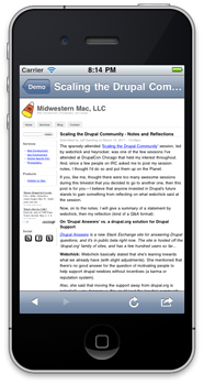
So, what did I do? I created JJGWebView, a drop-in Web View (in-app browser) that you can use to show URLs and allow users to navigate around the web, inside your app (see screenshot below). Instructions are here, and you can download the class and demo from GitHub: JJGWebView on GitHub.

This class has features almost identical to the Twitter in-app browser, and is clean and simple. If you find any errors, or have any feature requests or patches, please send them in on GitHub: JJGWebView Issues.
Comments
Its a wonderful thing Jeff! Thank you so much for posting this - I've ended up with a much better result and much more quickly than I would have!
I'm glad I could help!
Thanks Jeff, your post helped me too.
What setting would I use to make the bottom toolbar display at the top of the view instead of the bottom... sorry IOS newbie
For that, you'd need to edit the webview in the Interface Builder (or just open the .xib file in Xcode 4), and then drag the bar and all the stuff in it up to the top of the screen, and drag the webview area down under the bar.