ios

Review: NOYCE 13' (4m) Lightning cable

tl;dr: If you need a long Lightning cable, this is one of the few reliable options. If you need the fastest charging possible for an iPad, stick to Apple's much shorter cable.

A year or so ago, the owner of NOYCE Labs sent me a sample iPhone-compatible microphone to test, and I really liked it—I still use it for impromptu recordings with my iPhone, in fact!
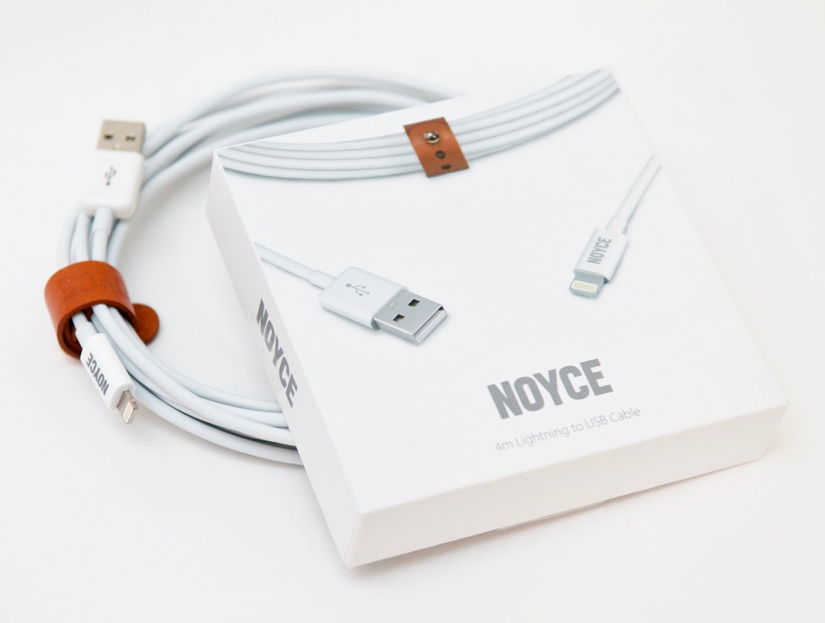
NOYCE 4m 13ft Lightning Cable with Box

So when I got an email requesting I review NOYCE's latest product, the longest (at least that I know of) Lightning USB cable available on Amazon, I gladly accepted. NOYCE sent me their 13-foot-long (4 meters for the non-Imperial reader) Lightning cable, and I've used it for a couple months now, so I figured it was a good time for a review.
Adapting Your iOS App to work with iPhone 5/iOS 6

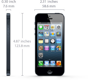
iPhone 5 Specs and DimensionsFor the non-Retina to Retina changes, most developers simply needed to add a bunch of @2x graphics, and maybe change a few little things here and there. Most parts of an app Just Worked™ on the higher resolution display, as long as the app used native controls and views, and didn't have a ton of custom interface elements.
However, with the iPhone 5, there are some other things that are changing a bit more radically—there's a bit of extra height (or width, in landscape), and iOS 6 is introducing a new way of handling device rotation and display changes.

Since most of the apps I manage are relatively simple, and only contain a few UIScrollViews, UITableViews, and UIViews, I only have to perform a few quick changes to my apps to get them ready for iOS 6 and the iPhone 5:

App for iOS/Android - Jesuit Conference App

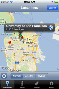
The Jesuit Conference partnered with Midwestern Mac, LLC to create a new app for the 450-year old Society of Jesus; the app includes three sections—Locations, News and Prayers—that offer users the ability to find Jesuit retreat centers, parishes, and schools, follow along with Jesuit news from National Jesuit News, and join in with users around the world in different Jesuit prayers and spiritual works.

Jesuit App for iOS - Locations

Download the app: iTunes Link | Android Link (coming soon!)

Why I don't develop for Android first

I developed my first iOS app about a year and a half ago, and it has seen over 2,500 downloads (it's a free app, and pretty useful, albeit only for a certain portion of people living in St. Louis, MO).

I developed my second iOS app (a companion to a news aggregation website that's existed since 2009) in April 2011, and in the first month alone, it was purchased ($0.99) over 300 times. In the months that followed, the app has consistently sold over 50 copies, sometimes more than 100, without—literally—any marketing on my part. Just an occasional plug on Twitter or at a conference. That's it.

I then decided to finally take the plunge and try my hand at redeveloping the app for Android (my first Java/Android project), and worked very hard to make the app run as good, and sometimes even better on Android phones (anything running 2.2+...).

Sales per app marketplace
Translation: Why I won't develop for Android first (no matter the marketshare).

The first month of sales have been more than disappointing; after 8 sales on the first day—most to friends who I specifically asked to download the app and test it*—the app has sold maybe one or no copies each day since, and all in the U.S. (The app has four five star reviews, the market page, icon, etc. are all very good quality—I spent a lot of time on the text, design, icon, etc., even forming everything to Android Market/platform standards instead of reusing iOS resources).

Microsoft Xbox 360 2011 December Update Apes iOS slide-to-search

In yet another example of Microsoft copying Apple's user interface concepts, the latest update to the Xbox 360's dashboard/Xbox LIVE integration now uses the same 'slide-to-left-to-search' user interface paradigm that started with Apple's iOS 3.0. Watch for yourself in the video below:

With Windows Phone 7, Microsoft's been taking some great steps in a new and innovative direction in UX/interaction design... but it seems their design teams still copy off Apple when they need to. Of course, there are worse companies to copy from—at least they're not copying Android!

Rooting Android - General Observations and OG Droid + LG Ally

After a couple years having had no experience with an Android phone of any variety, a generous Twitter follower I had met donated two older Android phones, an original Motorola Droid (running Froyo 2.2.2) and an LG Ally (also running 2.2.2), so I could learn the Android UI and work on porting a couple of my iOS apps.

One unfortunate reality of the Android ecosystem is that phones are often abandoned by their manufacturers after only a year (or less time), and even if not, they are not kept up to date past one or two minor Android OS releases. For instance, both the Ally and Droid are more than capable of running Android 2.3 Gingerbread (and I'm now running 2.3.7 on the Droid, faster than 2.2.x ever ran), but Motorola has ended support for the device.

WYSIWYG Editing (contentEditable support) in iOS 5

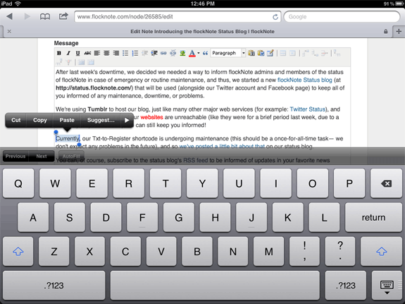
I haven't seen much about this feature yet, so I figured I'd put it through its paces and share what I found. WYSIWYG editing on iOS devices is finally here! For a long time, contentEditable support has been lacking on iPads, iPhones, and iPod Touches, and it's been slightly annoying, as the only way to add richly-formatted text on these devices was doing a two-step through finding the carat characters and writing the HTML yourself.

Plus, some WYSIWYG editors (like TinyMCE) simply disabled the WYSIWYG from attaching to a textarea if it detected an iOS device. No longer, however: I've tested CKEditor (latest nightly) and TinyMCE (latest nightly), and both work perfectly (surprisingly well, in fact!) on the iPad running iOS 5 beta 6:

iPad 2 WYSIWYG TinyMCE Editing

CNL - Catholic News Live iOS/Android Mobile App

Catholic News Live - CNL App IconThe second app developed by Midwestern Mac is Catholic News Live, or CNL for short. This app, which is the iPhone/iPod Touch/iPad/Android interface for the content aggregated by the Catholic News Live website, showcases a simple list and map layout on mobile phones and tablets, as well as Drupal's great flexibility.

The Catholic News Live website uses the Drupal distribution Managing News, which allows the site administrator to add news feeds that are automatically imported on a set schedule from websites all around the world. Each story is geotagged with a location (if proper locational keywords exist in the article), and then stories have latitude and longitude values for map display.

Best Practices and Tips for In-App iPhone or iPod Touch UIWebView Browsers

Or... "Best Practices of In-App Web Browsers"

Being the usability nut that I am, I have decided that my goal of making a perfect in-app browser for various iPhone apps is an impossible task. But, judging from what I've been able to do so far, and from many different Web View examples I've seen from around the web, there are some basics that every in-app browser should get right.

I'll start by showing the in-app browser in two very well-known iPhone apps: Facebook and Twitter.


Facebook's Browser

Twitter's Browser

Fundamentally, and functionally, these two in-app browsers are the same. And, after looking at maybe a few hundred other browsers, It seems like the list of essential features of a usable in-app browser are: