design

Cosplaying as a Sysadmin

An ode to the homelabber:

Gold Cosplaying as a Sysadmin T-Shirt by Jeff Geerling

As a software developer, I never was a true sysadmin. I never pulled a server to replace a failed drive at 3 a.m. I never got to roll my little maintenance cart through a cold aisle, with hearing protection to keep my fragile eardrums from rupturing amidst a sea of 100+ dB screaming server fans...

That is, until I built my homelab. Now I can act like a sysadmin as I make sure my kids never have a moment of downtime while they're streaming their favorite episode of Odd Squad.

Look inside the Raspberry Pi Zero 2 W and the RP3A0-AU

Today, Raspberry Pi released their new Zero 2 W, and it includes a new Raspberry Pi-branded chip, labeled RP3A0-AU.

I was able to get early access to the Zero 2, and I have a full review of the device on my YouTube channel, but I wanted to share more of the X-ray images I took of the device to reveal its inner workings, and because I just think they look cool. Also, I paid a bit of money to get these pictures, so might as well share!

First, here's what the Zero 2 W looks like in person:

Raspberry Pi Zero 2 W

And here's what it looks like via X-ray:

Raspberry Pi Zero 2 W - X-ray vision

I made a custom ceiling mount for my camera

I shoot the 'A-roll' for my YouTube videos with a Sony a6000 and a small Glide Gear TMP 75 smartphone teleprompter:

Tripod setup with teleprompter and Sony a6000

Until recently, I had these mounted on a tripod just off the back corner of my desk:

Tripod in the way

Some people mount semi-permanent camera rigs on a pole on their desks (example), but my adjustable-height desk (by UPLIFT) is not rock solid, so sometimes when I'm typing or accidentally bump the desk, anything mounted to the desktop wobbles.

For lights, monitors, etc., a little wobble isn't a problem. But even with image stabilization in my camera, the wobble becomes noticeable if I have the camera physically attached to my desk.

How to Export a 2D illustration of a 3D model in OpenSCAD

I've been getting into OpenSCAD lately—I'd rather wrestle with a text-based 3D modeling application for more dimensional models than fight with lockups of Fusion 360!

One thing I wanted to do recently was model a sheet-metal object that would be cut from a flat piece of sheet metal, then folded into its final form using a brake. Before 3D printing the final design, or cutting metal, I wanted to 'dry fit' my design to make sure my measurements were correct.

The idea was to print a to-scale line drawing of the part on my laser printer, cut it out, fold it, and check to make sure everything lined up correctly.

Some online utilities took an STL file and turned it into a PNG, but they weren't great and most wouldn't output a PNG with the exact dimensions as the model (they printed too big or too small).

Here was my model:

3D Model for Mounting Plate in OpenSCAD

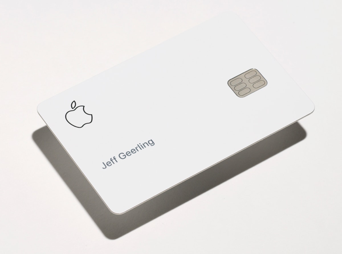
The physical Apple Card is a case of form over function

Apple Card is not just the physical card you get in the mail when you sign up for an Apple Card. There are a lot of upsides to what Apple's doing with Apple Card and Apple Pay.

I get it. And I also believe the physical titanium Apple Card is a marvel of engineering. Kudos to the metallurgists and designers who produced it—it would easily make for a durable and beautiful display piece on the history of monetary transfer.

Apple Card - Jeff Geerling - Front hero shot

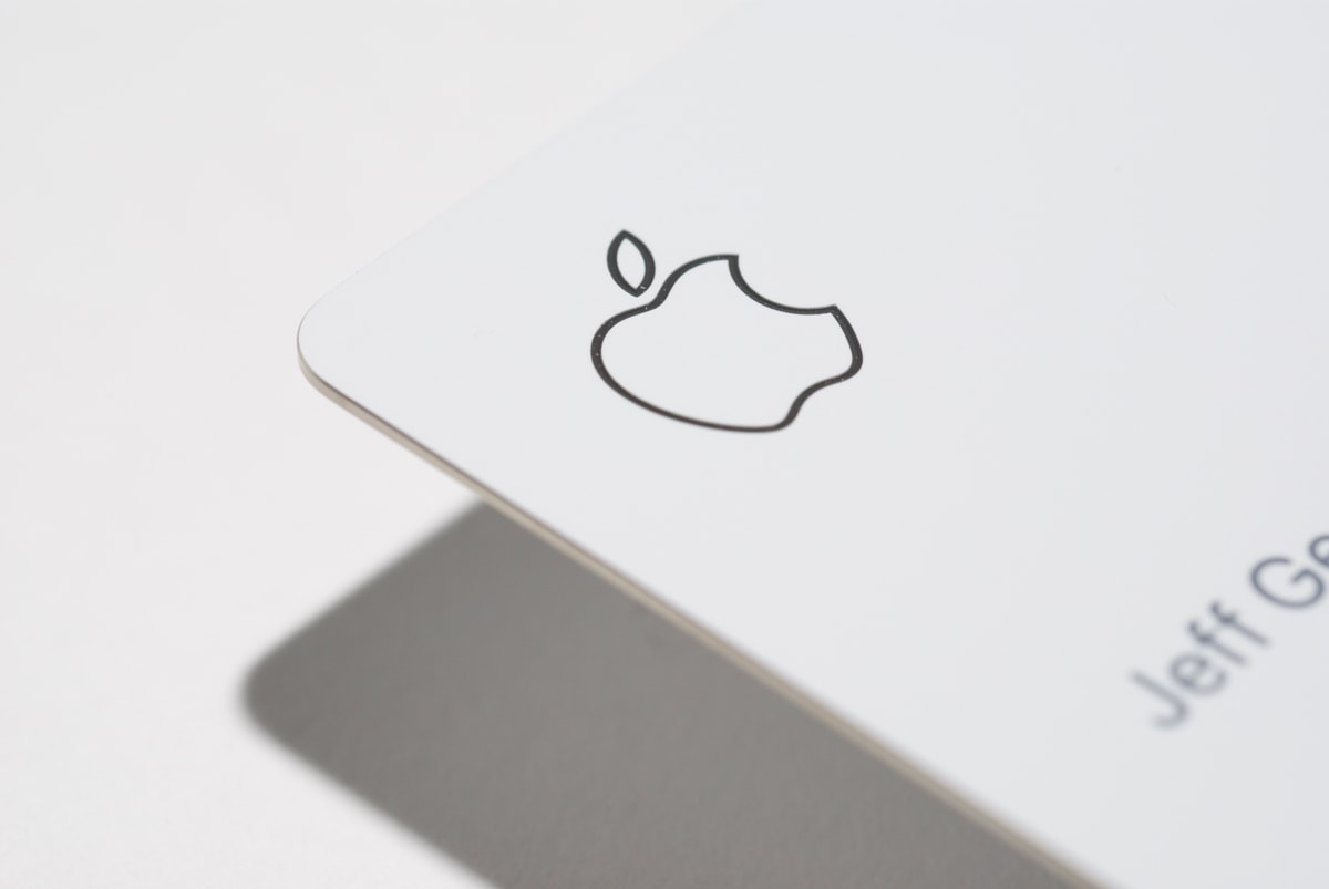
The card feels great in your hand. It has a beautiful white finish. The letter and logo detail is impeccable.

Apple Card - Apple logo detail

The way the magstripe seamlessly integrates into the titanium structure of the card is beautiful, and probably required some extremely precise machining.

Jeff Geerling.com now supports Dark Mode in macOS 10.14

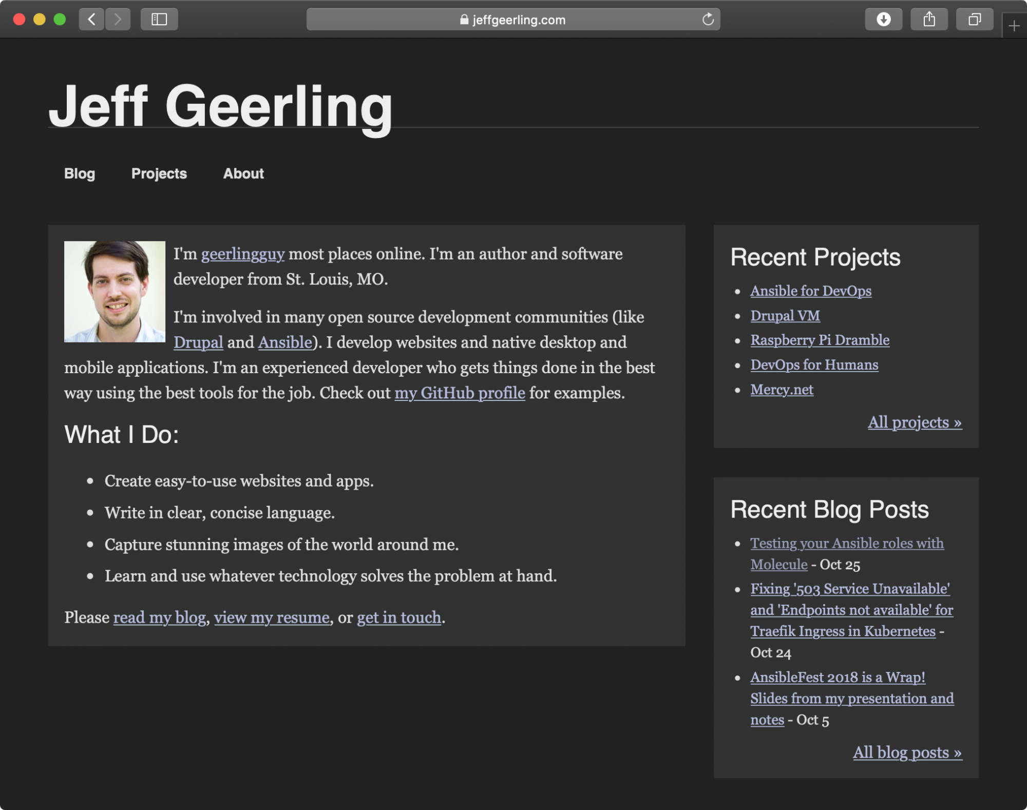
Over the years my site has evolved quite a bit; I started this site (well, one form of it at least) around 2004, when table based web design was still a thing. I've evolved the design from table-based to CSS, to semantic CSS, to CSS + RDF, then to mobile-first... and now that macOS 10.14 Mojave is here, with a snazzy (and way easier on my eyes) dark mode, I have made the design work well in both normal (light) and dark mode on macOS.

It's using a new feature in the Webkit nightly builds (er, now called Safari Technology Preview), a media query named (at least, for now) prefers-color-scheme.

And here's how the site looks when you're using Safari Technology Preview 68+ in macOS Mojave with Dark Mode:

Jeff Geerling.com in dark mode on macOS Mojave

Changing the font for one character in a string on a Drupal site

File this under the "it's a very bad idea, but sometimes absolutely necessary" category: I was working on a site that wanted to use a particular font for headlines throughout the site, but the client detested one particular character (an ampersand), and requested any time that character were to occur in the page title, it would be swapped out for a different font.

If at all possible, you should avoid doing what I'm about to describe—but in the off chance you need to have an automated way to scan a string of text and change the font family for one particular character, this is what to do:

First, you need to create a special CSS class that you can apply to the individual character, so in your theme's CSS, add something like:

Yet Again: Catholics, please stop stealing artwork and graphics!

I feel like a broken record... yet again, I was perusing the Internet (this time, Twitter), and then I noticed an illustration—a very familiar one—of the Roman collar (the white collar worn by priests):

@Boutleg didn't create the graphic; it looks like uCatholic originally posted the graphic on Facebook, where it was shared and reshared thousands of times, and liked (through that network of shares) many thousands of times.

Responsive design > mobile sites

There are individuals and companies who still believe it would be in their best interest to maintain a 'desktop' version of their website, and a completely or mostly-separate 'mobile' version of their site, and this belief (especially in the corporate arena) was strengthened by a recent (2012) report by the Nielsen Norman Group, Mobile Site vs. Full Site, which recommended a separate mobile site with stripped-down features and different design. The idea of having a mobile-optimized design is good—but not with the cost of making it a stripped-down version of your 'full' site, as Nielsen seems to recommend.

Mobile PNC Website

There are many problems with having separate versions of the website, especially as we near a point where many sites are accessed more on mobile devices (tablets, smartphones), and less on traditional desktop computers:

Server Check.in - Website and Server uptime monitoring

Server Check.in is a simple and inexpensive server and website uptime monitoring service I've recently launched.

Server Check.in logo

If you have a website or online service you need to make sure is running, Server Check.in is a great way to get notified when there's a problem. Unlike most other monitoring solutions, Server Check.in offers free SMS (text) messages and email notifications, and it only costs $15/year (just $1.25/month!).

The Motivation

There are probably thousands of other uptime monitoring services on the web, and it's typically a good idea to use existing tools rather than build your own—if they're practical for your needs!

I had three main requirements for any service I wanted to use: