design

Computers are amazing

In a break from the typical kind of writing I do here, I'd like to mention a few thoughts I've had after reading some opinion pieces on the reparability (or lack thereof) of the new MacBook Pro with Retina display.

Early PCs and Macs

The first computer I owned was a scrap-parts 386 DOS-based PC. I found a working 386 processor from a broken computer, scrounged 1MB of RAM from a couple dead motherboards, found a small hard drive and floppy drive, and slapped it all together inside a huge metal case. It ran great, except when one of the components failed—which seemed to happen on a monthly basis.

My First 386 PC - Gutted
My first PC - and all the tools necessary for PC repair!

While using early PCs, I had to deal with IRQ addresses, serial port driver conflicts, floppy drive cables malfunctioning, hard drive errors, and power supply fuses breaking... not to mention the myriad software incompatibilities with various bits of hardware (and I couldn't just Google "<device name> + <windows 3.1>"!).

I even spent quite a bit of time hardware hacking with the first few Macs I owned (a Mac IIci, a PowerBook 180c, and then a few other Mac desktops and towers—more history here).

Throughout high school and college, I helped a few hundred people repair or upgrade their computers, first through 'Jeff's Computer Service' (as a side/hobby job), and then through Midwestern Mac, LLC (this site's company). I loved working on computers, and still do! From the earliest computers until the past five or so years, most computers required some level of technical knowledge to be used effectively, and required repairs and upgrades at least once or twice a year.

But times have changed; I've since dropped 'computer repair' from the services I provide, because the only service requests are for Windows users who have found some way to clutter up their computer with strange search toolbars and other junkware.
Pope exhorts us to reflect in silence during 2012 Communications Day

Pope Benedict XVI's message for the 46th annual World Communications Day has been published on the Vatican website. We learned earlier that his theme for this year is silence, and the message is brief and impactful.

One passage that stood out in my reading was the following (emphasis mine):

Attention should be paid to the various types of websites, applications and social networks which can help people today to find time for reflection and authentic questioning, as well as making space for silence and occasions for prayer, meditation or sharing of the word of God. In concise phrases, often no longer than a verse from the Bible, profound thoughts can be communicated, as long as those taking part in the conversation do not neglect to cultivate their own inner lives.

Making your current Drupal theme responsive, simply

For a few of my smaller sites (like my portfolio website, www.jeffgeerling.com), I've had a little todo item on my list for the past year or so to make the them 'more responsive'—mostly meaning "make it legible on an iPhone or comparable Android phone". Most tablets I've used render traditional 960px layouts appreciably well, including the iPad, Kindle Fire, Samsung Galaxy Tab, etc., so I want to just focus on making the websites usable on smartphones.

What we had, and what we're going for (which one seems more readable and user-friendly on a small screen?):

Life is a Prayer.com - Responsive Design (Before)    Life is a Prayer.com - Responsive Design (After)

I'll show you how I quickly (in less than half an hour) added a <meta> tag to the site's <head> tag to instruct mobile phones on the width of my site, and how I added a simple @media query to my theme's stylesheet to apply a few layout rules to make the design of the site better for mobile phones.

Life is a Prayer - Looking great on your smartphone!

For the first time ever, I decided to make one of my personal sites look good on mobile phones by incorporating 'responsive' design. Basically, I use some spiffy CSS to say "when you're viewing Life is a Prayer.com on an iPhone, or Android phone, or a window smaller than x pixels, change the layout of the site so it's a LOT easier to read.

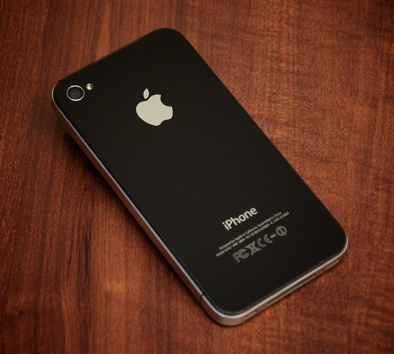
Lifeisaprayer.com - Responsive design on iPhone 4s

So, if you have a mobile phone that runs iOS or Android, whip it out really quick, head over to Life is a Prayer.com, and tell me what you think (even the comment form works great now!).

If you don't have a smartphone, but you use a modern web browser, try making the browser skinnier until you see how the content on the site re-flows (and images resize) so they fit the window a bit nicer!

Advent Wreath - Vector Illustration

I was recently inspired by Jeffrey Miller's embeddable Advent Wreath widget to try my hand at illustrating and animating an advent wreath in HTML5 with the <canvas> element or by animating an SVG.

My heart was in it for a while, but I ultimately gave up on the project due to the fact that I had already spent a couple hours on it and wasn't happy with my progress...

Advent Wreath - Vector Illustration by Jeff Geerling

However, I did end up with a fairly good illustrator/vector wreath and candles (I spent a bit of time trying to get the flames looking just right), and also created a brush to create the actual wreath, making it look somewhat like an evergreen wreath.

Problems with Android's Back Button

Android's back button is a problem. A big problem.

Others have already identified this in a broad sense, but I wanted to give a few concrete examples of why I (as a guy who wants to simply port a couple apps from the iOS platform to Android) think the back button (especially) is a bad idea.

Disorientation

Mobile phones, and tablets especially, require a lot of UX work in the area of interface orientation. For my extremely-basic CNL app, I've spent hours tweaking little interface elements that change when the interface is rotated from portrait to landscape.

The tendency in iOS is to use a 'back' button with the label of the previous function/screen in a given app in a navigation bar at the top of the current screen. This allows a user to freely move about inside an app, and is pretty much consistent across all apps. Additionally, this 'universal back button' is always at the top left of the screen—just like a web browser.

Best Practices and Tips for In-App iPhone or iPod Touch UIWebView Browsers

Or... "Best Practices of In-App Web Browsers"

Being the usability nut that I am, I have decided that my goal of making a perfect in-app browser for various iPhone apps is an impossible task. But, judging from what I've been able to do so far, and from many different Web View examples I've seen from around the web, there are some basics that every in-app browser should get right.

I'll start by showing the in-app browser in two very well-known iPhone apps: Facebook and Twitter.


Facebook's Browser

Twitter's Browser

Fundamentally, and functionally, these two in-app browsers are the same. And, after looking at maybe a few hundred other browsers, It seems like the list of essential features of a usable in-app browser are:

Moving from Drupal 6 to Drupal 7 - A Themer's Perspective

The transition from Drupal 6 to Drupal 7 has taken a bit of time, and I (like many others) simply haven't had enough time in the past few months to do D7 testing while in the midst of tens of other D6 projects.

I've committed, though, to building out three Drupal sites in Drupal 7, now that we're at beta-3, and I will be posting a few reflections, mostly from a themer's perspective on some changes—the good, the bad, and the confusing.

A New Default Theme - Bartik

Just like Drupal 5/6's default theme, Garland (which is in use on this site right now :-/), Bartik will be seen on thousands of quickly-built sites around the web, and I think the theme is robust enough for this purpose. I'm actually building one site's theme directly on top of Bartik, just modifying CSS through a single stylesheet added by a custom module.

But it's nothing amazing, in my opinion. I think it would've been awesome to have some sort of dropdown menu support in core by this point—but it looks like that will wait until Drupal 8 at least. This is probably the number one most requested feature I get on a lot of the smaller sites I'm asked to build, and having the feature in core would be über-cool.

Druplicon Golf Ball (DrupliGolf)

After having seen DrupliBacon and DrupliCake (there are other great adaptations of the Druplicon as well!), I decided I wanted to get some creative juices flowing this weekend. I present, DrupliGolf!

DrupliGolf - Druplicon on a Golf Ball

Drupligolf is the result of a round of golf, an addiction to Drupal, and a love for the best OSS mascot in existence. (The latter reason will definitely strike a chord with anybody who's shared a drink with the Druplicon in #drupal... and actually drank).