ux

Use Ansible's YAML callback plugin for a better CLI experience

Ansible is a great tool for automating IT workflows, and I use it to manage hundreds of servers and cloud services on a daily basis. One of my small annoyances with Ansible, though, is its default CLI output—whenever there's a command that fails, or a command or task that succeeds and dumps a bunch of output to the CLI, the default visible output is not very human-friendly.

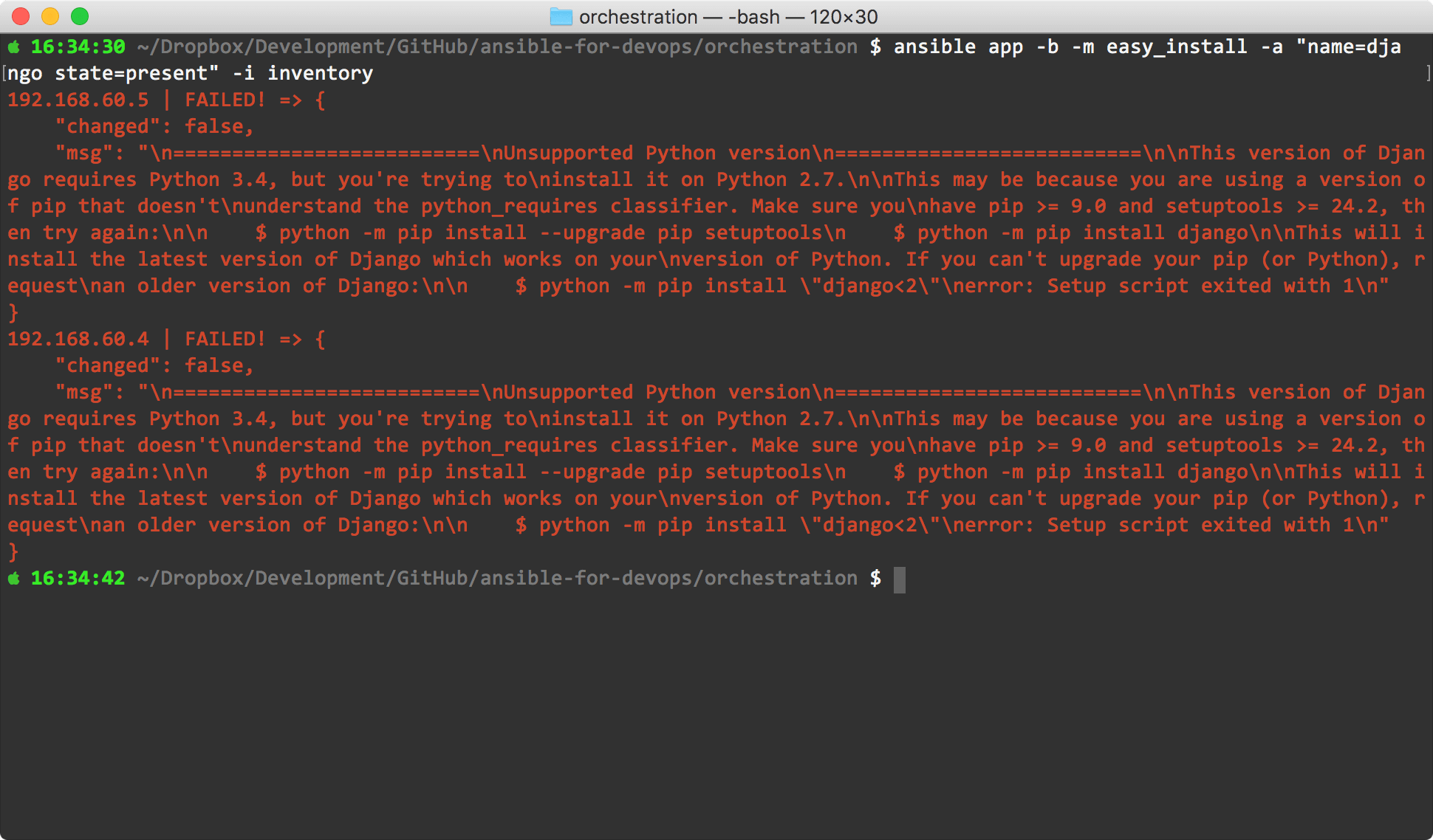
For example, in a Django installation example from chapter 3 of my book Ansible for DevOps, there's an ad-hoc command to install Django on a number of CentOS app servers using Ansible's yum module. Here's how it looks in the terminal when you run that task the first time, using Ansible's default display options, and there's a failure:

Ansible 2.5 default callback plugin

...it's not quickly digestible—and this is one of the shorter error messages I've seen!

Responsive design > mobile sites

There are individuals and companies who still believe it would be in their best interest to maintain a 'desktop' version of their website, and a completely or mostly-separate 'mobile' version of their site, and this belief (especially in the corporate arena) was strengthened by a recent (2012) report by the Nielsen Norman Group, Mobile Site vs. Full Site, which recommended a separate mobile site with stripped-down features and different design. The idea of having a mobile-optimized design is good—but not with the cost of making it a stripped-down version of your 'full' site, as Nielsen seems to recommend.

Mobile PNC Website

There are many problems with having separate versions of the website, especially as we near a point where many sites are accessed more on mobile devices (tablets, smartphones), and less on traditional desktop computers:

reCAPTCHAs are easier to read—but they're still a bad idea

From the article reCAPTCHAs are finally readable by normal humans:

Google today announced that reCAPTCHAs served up to humans are finally readable without the need to squint your eyes or bang your keyboard in frustration after typing the wrong sequence of letters five times in a row. Who can even read those things, amirite?

I'm glad Google is making CAPTCHAs easier for humans to read. For the very, very rare times when they're necessary, that's a good thing.

However, I want to make an appeal to the thousands of developers who are thinking of implementing a CAPTCHA to deal with their site's form/registration spam: use CAPTCHAs only as a last resort.

CAPTCHAs - the Nuclear Form Spam Prevention Technique
CAPTCHAs: The nuclear option.

Apache Kerberos Authentication and basic authentication fallback

Many businesses and organizations use Active Directory or other LDAP-based authentication systems, and many web applications (like Drupal) can easily integrate with them for authentication and user account provisioning.

The Kerberos Module for Apache allows users to be automatically logged into your web application, by passing through their credentials behind the scenes. This makes for a seamless user experience—the user never needs to log into your web application if the user is authenticated on his local machine.

A standard configuration for Kerberos authentication inside your Apache configuration file looks like:

Making your current Drupal theme responsive, simply

For a few of my smaller sites (like my portfolio website, www.jeffgeerling.com), I've had a little todo item on my list for the past year or so to make the them 'more responsive'—mostly meaning "make it legible on an iPhone or comparable Android phone". Most tablets I've used render traditional 960px layouts appreciably well, including the iPad, Kindle Fire, Samsung Galaxy Tab, etc., so I want to just focus on making the websites usable on smartphones.

What we had, and what we're going for (which one seems more readable and user-friendly on a small screen?):

Life is a Prayer.com - Responsive Design (Before)    Life is a Prayer.com - Responsive Design (After)

I'll show you how I quickly (in less than half an hour) added a <meta> tag to the site's <head> tag to instruct mobile phones on the width of my site, and how I added a simple @media query to my theme's stylesheet to apply a few layout rules to make the design of the site better for mobile phones.

Microsoft Xbox 360 2011 December Update Apes iOS slide-to-search

In yet another example of Microsoft copying Apple's user interface concepts, the latest update to the Xbox 360's dashboard/Xbox LIVE integration now uses the same 'slide-to-left-to-search' user interface paradigm that started with Apple's iOS 3.0. Watch for yourself in the video below:

With Windows Phone 7, Microsoft's been taking some great steps in a new and innovative direction in UX/interaction design... but it seems their design teams still copy off Apple when they need to. Of course, there are worse companies to copy from—at least they're not copying Android!

User-friendly spam prevention for your Drupal site

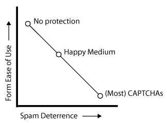
...such is the title of my session proposal for DrupalCon Denver 2012. I'm aiming the presentation at beginners, but it should be helpful for anyone with a Drupal site that has fought the battle with spammers—and lost.

Preventing form spam chart

Since I've had experience building and maintaining a variety of sites, from small blogs with a few posts a week, to large community sites with hundreds of posts and user accounts created per day, I figured I would try to share some of my experiences and what worked and what didn't. I hope to talk about the importance of keeping your site's user experience (UX) first, while still fighting off spammers, and then speaking about particular use cases and solutions.

Problems with Android's Back Button

Android's back button is a problem. A big problem.

Others have already identified this in a broad sense, but I wanted to give a few concrete examples of why I (as a guy who wants to simply port a couple apps from the iOS platform to Android) think the back button (especially) is a bad idea.

Disorientation

Mobile phones, and tablets especially, require a lot of UX work in the area of interface orientation. For my extremely-basic CNL app, I've spent hours tweaking little interface elements that change when the interface is rotated from portrait to landscape.

The tendency in iOS is to use a 'back' button with the label of the previous function/screen in a given app in a navigation bar at the top of the current screen. This allows a user to freely move about inside an app, and is pretty much consistent across all apps. Additionally, this 'universal back button' is always at the top left of the screen—just like a web browser.

Wrapper function for simple drupal_mail() sending in Drupal 7

Email is such a pain (I should know, as I'm currently working on a site that's sending 10-20,000 emails per day to 40,000+ users. Spam prevention, SPF records, bounce handling, abuse reports, deliverability, send rates, etc. are all huge hassles that must be dealt with when handling more than a few hundred emails a day.

For testing, I often like throwing in a quick bit of code to send me or someone else a simple email with a few bits of information when something happens on the site, or to test email addresses or formatting. Therefore I like having a quick one-line function call to send an email. In Drupal 6, there was a handy drupal_mail_send() function that would use some default settings and allow you to quickly shoot off a simple email (not translated, not pluggable, etc., but easy to implement).