redesign

Life is a Prayer - Looking great on your smartphone!

For the first time ever, I decided to make one of my personal sites look good on mobile phones by incorporating 'responsive' design. Basically, I use some spiffy CSS to say "when you're viewing Life is a Prayer.com on an iPhone, or Android phone, or a window smaller than x pixels, change the layout of the site so it's a LOT easier to read.
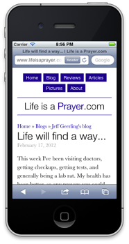
Lifeisaprayer.com - Responsive design on iPhone 4s

So, if you have a mobile phone that runs iOS or Android, whip it out really quick, head over to Life is a Prayer.com, and tell me what you think (even the comment form works great now!).

If you don't have a smartphone, but you use a modern web browser, try making the browser skinnier until you see how the content on the site re-flows (and images resize) so they fit the window a bit nicer!

What happened to Life is a Prayer.com?

[Update: I've finished building a new theme for Life is a Prayer.com; it's a bit of the old, mixed in with a bit of the new. What do you think?]

I'm in the middle of upgrading Life is a Prayer.com to Drupal 7 (to the non-geeks out there: I'm changing up the structure of the site a little bit, and giving it a new coat of varnish).

So... for a while you'll probably see a few things here and there that are out of place (especially in sections like the Pictures area, where photo galleries are displayed). Please report any problems you have in the comments below, and wish me luck as I start redesigning the site to make it look even better than ever!

(This current look is only temporary - Things will be back to normal soon!).

Case Study: Saint Louis Review News Website

In what will be the first of, I hope, many case studies, I review the process of redesigning the Saint Louis Review website, from the ground up.

The Saint Louis Review is a local Catholic diocesan newspaper serving the nearly 500,000 member Archdiocese of Saint Louis. The newspaper has had a website since the late 90s, which was ported to a custom-designed CMS in 2001. The PHP/MySQL-based site ran quite well throughout the first decade of this millennium, but was in need of either a serious overhaul or a redesign, to go along with the paper's new tabloid layout in April 2009.

Old and New Saint Louis Review Websites

The decision was made in 2007 to port the website to Joomla, but after a few months, a new editor, and more work, it was determined that, due to its extensibility, flexible out-of-the-box permissions, and standards/SEO-compliant codebase, Drupal would be a better fit for the site. Work was begun in January of 2009 to transfer the custom CMS' articles database (over 17,000 articles) to a Drupal site, create a new template based off the colors and design of the new tabloid-format paper, and integrate an easier-to-manage ad system and back-end.