mobile

Using 4G LTE wireless modems on a Raspberry Pi

For a recent project, I needed to add cellular connectivity to a Raspberry Pi (actually, an entire cluster... but that's a story for a future time!).

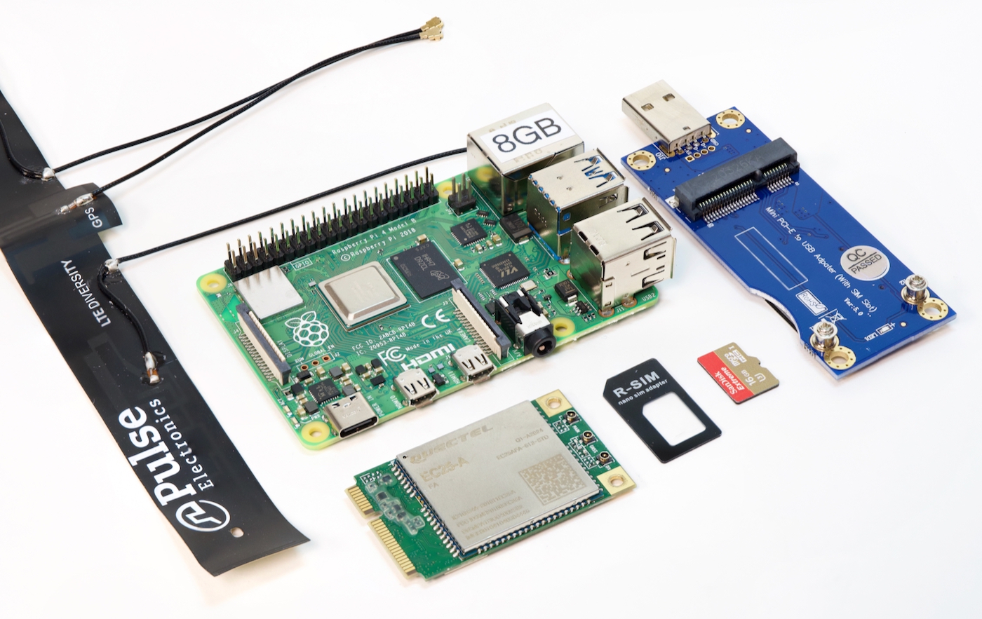
Raspberry Pi 4 model B with 4G LTE wireless Quectel modem and antenna and USB adapter

I figured I'd document the process in this blog post so people who follow in my footsteps don't need to spend quite as much time researching. This post is the culmination of 40+ hours of reading, testing, and head-scratching.

There doesn't seem to be any good central resource for "4G LTE and Linux" out there, just a thousand posts about the ABC's of getting an Internet connection working through a 4G modem—but with precious little explanation about why or how it works. (Or why someone should care about random terms like PPP, ECM, QMI, or MBIM, or why someone would choose qmi_wwan over cdc_ether, or ... I could go on).

Hopefully you can learn something from my notes. Or point out places where I'm glaringly wrong :)

Responsive design > mobile sites

There are individuals and companies who still believe it would be in their best interest to maintain a 'desktop' version of their website, and a completely or mostly-separate 'mobile' version of their site, and this belief (especially in the corporate arena) was strengthened by a recent (2012) report by the Nielsen Norman Group, Mobile Site vs. Full Site, which recommended a separate mobile site with stripped-down features and different design. The idea of having a mobile-optimized design is good—but not with the cost of making it a stripped-down version of your 'full' site, as Nielsen seems to recommend.

Mobile PNC Website

There are many problems with having separate versions of the website, especially as we near a point where many sites are accessed more on mobile devices (tablets, smartphones), and less on traditional desktop computers:

Review: iPhone 5

Jeff's Rating: 5/5

tl;dr: Apple's steady, incremental improvements keep crushing any hope of a competing product with as much polish and panache.

The iPhone 5 is another hit in Apple's line of incrementally-improved iPhones. The iPhone 5 is noticably faster, lighter, and more seductive than the 4S that preceded it. It's aluminum (or 'aluminium' if you're from the UK) case is much more resilient and sleek than the 4/4S's glass back, and it looks much sleeker than the old plastic back on the iPhone 3G/3Gs.

Looks to Kill

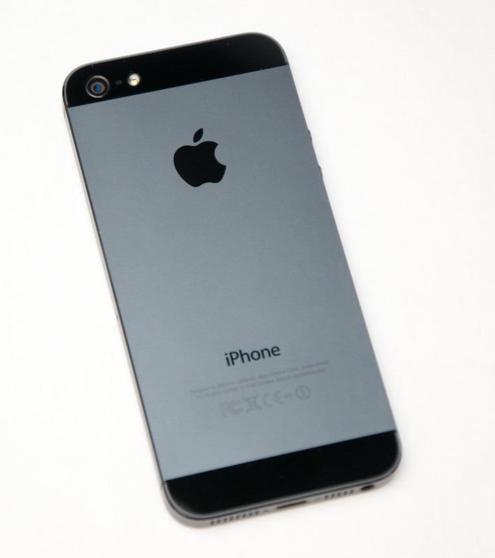
iPhone 5 Back

Making your current Drupal theme responsive, simply

For a few of my smaller sites (like my portfolio website, www.jeffgeerling.com), I've had a little todo item on my list for the past year or so to make the them 'more responsive'—mostly meaning "make it legible on an iPhone or comparable Android phone". Most tablets I've used render traditional 960px layouts appreciably well, including the iPad, Kindle Fire, Samsung Galaxy Tab, etc., so I want to just focus on making the websites usable on smartphones.

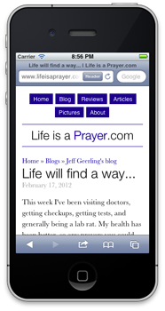
What we had, and what we're going for (which one seems more readable and user-friendly on a small screen?):

Life is a Prayer.com - Responsive Design (Before)    Life is a Prayer.com - Responsive Design (After)

I'll show you how I quickly (in less than half an hour) added a <meta> tag to the site's <head> tag to instruct mobile phones on the width of my site, and how I added a simple @media query to my theme's stylesheet to apply a few layout rules to make the design of the site better for mobile phones.

Life is a Prayer - Looking great on your smartphone!

For the first time ever, I decided to make one of my personal sites look good on mobile phones by incorporating 'responsive' design. Basically, I use some spiffy CSS to say "when you're viewing Life is a Prayer.com on an iPhone, or Android phone, or a window smaller than x pixels, change the layout of the site so it's a LOT easier to read.

Lifeisaprayer.com - Responsive design on iPhone 4s

So, if you have a mobile phone that runs iOS or Android, whip it out really quick, head over to Life is a Prayer.com, and tell me what you think (even the comment form works great now!).

If you don't have a smartphone, but you use a modern web browser, try making the browser skinnier until you see how the content on the site re-flows (and images resize) so they fit the window a bit nicer!

Mobile Phone SMS Spam Can be Expensive

I recently started receiving spam (unsolicited) text messages on my iPhone. I first received one on New Year's Eve, at 8:31 p.m., and then again at 5:00 a.m. a few days later (nice wakeup call... thanks).

These messages were all from some company named 'GagaCell', which didn't turn up many good search results (most were about Lady Gaga, and I'm pretty sure she doesn't harass people with text messages—just her music and lack of style.
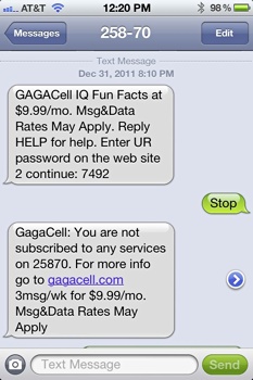
GagaCell IQ Spam Text Message

After some online research, I discovered that many people, even after sending STOP to these shortcodes, end up with monthly charges on their cell phone bills. Since I watch my bill pretty closely, I noticed that, all the sudden, I was getting a $9.99 subscription from 'BULLROARE', a content provider I'd never heard of, from short code 31850 (The subscription name was 'IQ32CALL8668611606').

Catholic News Live mobile app for Android

Just wanted to announce here the immediate availability of the Android version of the Catholic News Live Mobile App. You can buy the app for your Android-powered device on the Android Market: Catholic News Live.

The Android version joins the iOS version that's been out for about a year now, as well as the website, all three in combination allowing you to follow the latest Catholic News wherever you are, on whatever platform you use! Read more about the Catholic News Live mobile app »

Here are a few screenshots from the app on an Android phone:

Problems with Android's Back Button

Android's back button is a problem. A big problem.

Others have already identified this in a broad sense, but I wanted to give a few concrete examples of why I (as a guy who wants to simply port a couple apps from the iOS platform to Android) think the back button (especially) is a bad idea.

Disorientation

Mobile phones, and tablets especially, require a lot of UX work in the area of interface orientation. For my extremely-basic CNL app, I've spent hours tweaking little interface elements that change when the interface is rotated from portrait to landscape.

The tendency in iOS is to use a 'back' button with the label of the previous function/screen in a given app in a navigation bar at the top of the current screen. This allows a user to freely move about inside an app, and is pretty much consistent across all apps. Additionally, this 'universal back button' is always at the top left of the screen—just like a web browser.

Sanctifying Mobile Technology - #CNMC11

CNMC 2011 017
My best zen face. (Photo from Scott Maentz).

I just finished my workshop presentation at the Catholic New Media Celebration entitled "Sanctifying Mobile Technology." I talked about some ideas I have to help Catholic parishes and organizations spread their mission through iPhones, iPads and other mobile devices.

My full presentation was recorded, but I don't have the video yet. However, I do have all the slides, and tons of links, over on the presentation page here on Life is a Prayer.com.

You can view photos from CNMC '11 in the linked Flickr group.