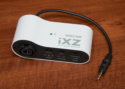
Review: Tascam iXZ Mic and Guitar Interface for iOS
tl;dr: Likely the best interface for the iPhone headset jack, especially when considering the price. Hardware could use some improvement, but it works pretty well.

tl;dr: Likely the best interface for the iPhone headset jack, especially when considering the price. Hardware could use some improvement, but it works pretty well.

Elizabeth Westhoff, the Archdiocese of St. Louis' Director of Marketing, wrote an excellent article summarizing the many ways she and others in St. Louis are using iPhones and a shoestring budget to promote the faith through video, pictures, social media, etc.
I love this section:
The production of each of these videos is something unseen in most other archdioceses across the country and for those of us who have been involved in their production; it has been a complete labor of love with an understanding that it is yet another way of getting out the messages of Christ.
One of the most amazing things we have been able to do is to use our iPhones as recording equipment.
When one or two of us go out on these “simple” video shoots, I’m always afraid the people on the other side of the “camera” are thinking we’re not prepared, or professionals, or something else along those lines. We show up with a tripod, lights from Home Depot, a battery-operated microphone, an iPhone and nothing else. We have everything we need, really.
tl;dr: For stereo audio input, mic input, and guitar input, there's nothing better. Sound quality is excellent, and the unit is physically solid—almost too solid!
[Update on iPhone 5 compatibility: Sonoma says the GuitarJack works like a champ with the iPhone 5 if you use one of Apple's 30-pin to lightning connectors.]
In my quest to find the killer solution for audio recording/input on my iOS devices, I've tested a ton of different external microphones and audio interfaces for the iPhone 4/4S, iPad, and iPod Touch. One class of device—a multi-channel input through the iPhone 4's dock connector—has been elusive until just recently, when three different devices were introduced a year after the iPhone 4:
Android's back button is a problem. A big problem.
Others have already identified this in a broad sense, but I wanted to give a few concrete examples of why I (as a guy who wants to simply port a couple apps from the iOS platform to Android) think the back button (especially) is a bad idea.
Mobile phones, and tablets especially, require a lot of UX work in the area of interface orientation. For my extremely-basic CNL app, I've spent hours tweaking little interface elements that change when the interface is rotated from portrait to landscape.
The tendency in iOS is to use a 'back' button with the label of the previous function/screen in a given app in a navigation bar at the top of the current screen. This allows a user to freely move about inside an app, and is pretty much consistent across all apps. Additionally, this 'universal back button' is always at the top left of the screen—just like a web browser.
I took this photo from the ground at Willis Tower (formerly Sears Tower) in Chicago, IL over the weekend. I also took a bunch of HD videos from the SkyDeck that I'll be putting together into a few minutes of video. Truly a majestic building, and I wonder if we'll ever see something taller in the U.S. Seems our architectural prowess is taking a back seat to the rest of the world lately.
As an aside, if the iPhone 4 takes pictures of this quality, I can't wait to get an iPhone 4S and ditch my Nikon D7000 for many of my trips. While using a 50mm f/1.4 inside in a dim room and still getting nice shots is awesome, having a camera that's always with me and gets 'pretty good' shots is also awesome. I hope to get a 4S soon!

My best zen face. (Photo from Scott Maentz).
I just finished my workshop presentation at the Catholic New Media Celebration entitled "Sanctifying Mobile Technology." I talked about some ideas I have to help Catholic parishes and organizations spread their mission through iPhones, iPads and other mobile devices.
My full presentation was recorded, but I don't have the video yet. However, I do have all the slides, and tons of links, over on the presentation page here on Life is a Prayer.com.
You can view photos from CNMC '11 in the linked Flickr group.
This page contains information and resources pertaining to my 2011 presentation at the Catholic New Media Celebration entitled "Gadgets & Gizmos: Sanctifying Mobile Technology".
You can download a PDF file with all the slides from the presentation here: Sanctifying Mobile Technology [3.1 MB PDF].
More information will be posted here after the presentation.
tl;dr: Five stars for the capabilities, four for the fit and finish. It's a great tool, but not without a few rough edges. (See note about iPhone 4S compatibility).
[UPDATE on iPhone 4S compatibility: I've heard many reports of people having trouble with the AR-4i and the iPhone 4S; my own usage indicates that there is one quirk with this combo: the wireless signals on my phone go away while plugged into the AR-4i. Example recordings with various firmwares below:
I haven't seen much about this feature yet, so I figured I'd put it through its paces and share what I found. WYSIWYG editing on iOS devices is finally here! For a long time, contentEditable support has been lacking on iPads, iPhones, and iPod Touches, and it's been slightly annoying, as the only way to add richly-formatted text on these devices was doing a two-step through finding the carat characters and writing the HTML yourself.
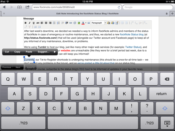
Plus, some WYSIWYG editors (like TinyMCE) simply disabled the WYSIWYG from attaching to a textarea if it detected an iOS device. No longer, however: I've tested CKEditor (latest nightly) and TinyMCE (latest nightly), and both work perfectly (surprisingly well, in fact!) on the iPad running iOS 5 beta 6:

Thanks to iOS5's support for contentEditable text areas, rich text editors like TinyMCE and CKEditor (two of my favorites, which I install on many Drupal sites using the WYSIWYG module) now work great for editing content on the web in mobile Safari!
This means that I'll be more likely to do site content work on the road with my iPad 2. I just wish they supported file select fields so I could also add images more easily on the go.
Check out all the details over on Midwestern Mac: WYSIWYG Editing (contentEditable support) in iOS 5.