css

Jeff Geerling.com now supports Dark Mode in macOS 10.14

Over the years my site has evolved quite a bit; I started this site (well, one form of it at least) around 2004, when table based web design was still a thing. I've evolved the design from table-based to CSS, to semantic CSS, to CSS + RDF, then to mobile-first... and now that macOS 10.14 Mojave is here, with a snazzy (and way easier on my eyes) dark mode, I have made the design work well in both normal (light) and dark mode on macOS.

It's using a new feature in the Webkit nightly builds (er, now called Safari Technology Preview), a media query named (at least, for now) prefers-color-scheme.

And here's how the site looks when you're using Safari Technology Preview 68+ in macOS Mojave with Dark Mode:
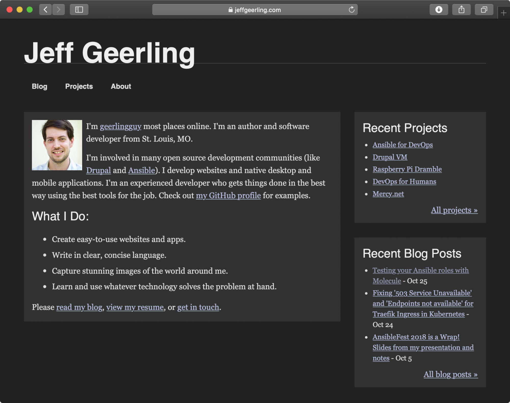
Jeff Geerling.com in dark mode on macOS Mojave

How to attach a CSS or JS library to a View in Drupal 8

File this one under the 'it's obvious, but only after you've done it' category—I needed to attach a CSS library to a view in Drupal 8 via a custom module so that, wherever the view displayed on the site, the custom CSS file from my module was attached. The process for CSS and JS libraries is pretty much identical, but here's how I added a CSS file as a library, and made sure it was attached to my view:

Add the CSS file as a library

In Drupal 8, drupal_add_css(), drupal_add_js(), and drupal_add_library() were removed (for various reasons), and now, to attach CSS or JS assets to views, nodes, etc., you need to use Drupal's #attached functionality to 'attach' assets (like CSS and JS) to rendered elements on the page.

In my custom module (custom.module) or custom theme (custom.theme), I added the CSS file css/custom_view.css:

Migrating style and script tags from node bodies into Code per Node

For a recent project, I needed to migrate anything inside <script> and <style> tags that were embedded with other content inside the body field of Drupal 6 nodes into separate Code per Node-provided fields for Javascript and CSS. (Code per Node is a handy module that lets content authors easily manage CSS/JS per node/block, and saves the styles and scripts to the filesystem for inclusion when the node is rendered—read more about CPN goodness here).

The key is to get all the styles and scripts into a string (separately), then pass that data into an array in the format:

Making your current Drupal theme responsive, simply

For a few of my smaller sites (like my portfolio website, www.jeffgeerling.com), I've had a little todo item on my list for the past year or so to make the them 'more responsive'—mostly meaning "make it legible on an iPhone or comparable Android phone". Most tablets I've used render traditional 960px layouts appreciably well, including the iPad, Kindle Fire, Samsung Galaxy Tab, etc., so I want to just focus on making the websites usable on smartphones.

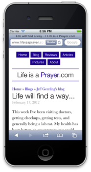
What we had, and what we're going for (which one seems more readable and user-friendly on a small screen?):

Life is a Prayer.com - Responsive Design (Before)    Life is a Prayer.com - Responsive Design (After)

I'll show you how I quickly (in less than half an hour) added a <meta> tag to the site's <head> tag to instruct mobile phones on the width of my site, and how I added a simple @media query to my theme's stylesheet to apply a few layout rules to make the design of the site better for mobile phones.

Life is a Prayer - Looking great on your smartphone!

For the first time ever, I decided to make one of my personal sites look good on mobile phones by incorporating 'responsive' design. Basically, I use some spiffy CSS to say "when you're viewing Life is a Prayer.com on an iPhone, or Android phone, or a window smaller than x pixels, change the layout of the site so it's a LOT easier to read.

Lifeisaprayer.com - Responsive design on iPhone 4s

So, if you have a mobile phone that runs iOS or Android, whip it out really quick, head over to Life is a Prayer.com, and tell me what you think (even the comment form works great now!).

If you don't have a smartphone, but you use a modern web browser, try making the browser skinnier until you see how the content on the site re-flows (and images resize) so they fit the window a bit nicer!

Using hook_init() to include CSS and JS files

For some time, I've been using the most hackish ways of including custom CSS and Javascript in my site via themes and custom modules. The problem has been (at least, in Drupal 6) that the hook_preprocess_page() function, inside which I'd really like to include my drupal_add_css() and drupal_add_js() functions, due to the fact that it's easy to see what page I'm on, or what kind of page I'm on, is not able to add CSS or JS to the page, due to the order in which the hooks are fired.

I've often just put my JS and CSS includes (via the drupal hooks) into the end of my custom module file, instead of inside a function at all.

However, a much cleaner way to include your CSS and JS is inside your own implementation of hook_init(). For example:

Benchmarking Safari on the iPad

Since purchasing the iPad, I've constantly been amazed by how fast everything works—switching between large apps is no longer a game of roulette, and browsing the web is a breeze.

I ran some tests on Safari on my iPad, just to see how things compare to my MacBook Pro...

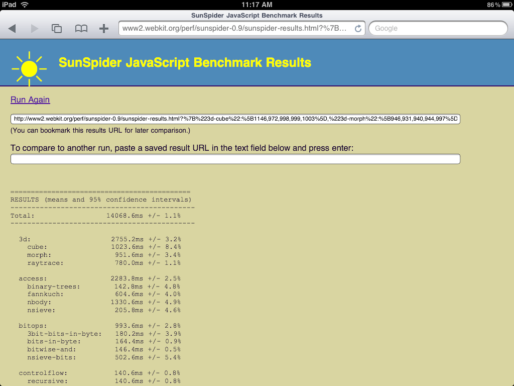
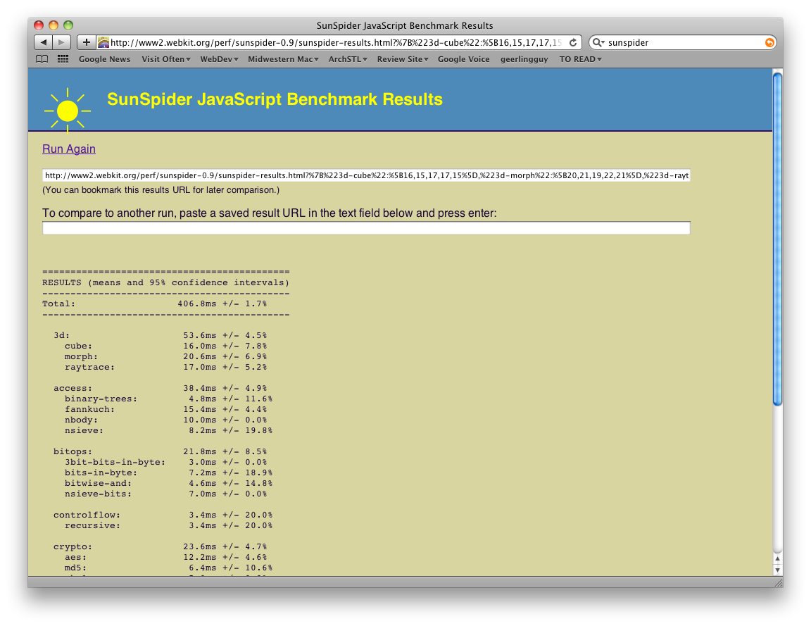
SunSpider Javascript Benchmark

Here's the screenshot from my iPad (14068.6ms):

Sunspider Results - iPad

And from my Mac (406.8ms):

Sunspider Results - Macbook Pro

The MacBook Pro (2.53 Ghz 15" with 4 GB of RAM) is about 34x faster than the iPad in raw JavaScript performance... not too surprising, but I'd guess this margin will be trimmed in the next five years, when everyone's carrying around a tablet :-)

Acid3 Test

Here's the screenshot from my iPad (took about 5 seconds):

Internet Explorer Woes: Floating a Span using jQuery - Order Matters!

I spent the greater part of two hours trying to debug an Internet Explorer bug today. Basically, I wanted to get an image that I uploaded to have a caption applied through jQuery. I used the Image Caption module for Drupal to do this, and set it to grab the 'alt' text in a <span> underneath the image, and wrap both the image and caption inside another <span>, which would grab the float/alignment for the image, and use that to float it left or right (or neither).

Well, in Internet Explorer 6 and 7, the image would appear on its own line, as a block-level element. I tried everything short of throwing my computer against a wall to get this to work, but was unsuccessful. I finally went for broke and tried some thing so dumb that it couldn't possibly work—but it did.

I changed the order of the inline css properties in the script so the float would be applied before the "display: block" value. Bingo, IE works great!

Some things that I have to do to get things to work in Explorer... I hate you, Microsoft!!

Building a Theme for Drupal 7

After having built out many themes for Drupal 6 (and a couple for Drupal 5), I'm going to start from scratch on a couple designs and build a theme in Drupal 7, which will be released sometime in 2010. I'll take you along my journey in this article.

Please note, this article is a work in progress, and I'll be updating it as I go. Hopefully, within a couple weeks, I'll have the article complete, and a nice new theme to release on Drupal.org (maybe), only for Drupal 7.

To get things kicked off, here are a few articles that have good background information on Drupal 7 theming: